


Simplifying enterprise search for Disney's physical security platform
Redesigning Global Search to help security analysts navigate thousands of records across multiple sites and modules — reducing search time by 20% and improving user satisfaction by 67%.
B2B
Enterprise SaaS
Overview
Analysts use Global Search to effectively find results among thousands of incidents across Disneyland. As designers, our team aims to identify the pain points to enhance the searching experience for analysts and optimize efficiency for the business.
Role
UX/UI Designer
Team
Designers · Product Manager · Developer
Timeline
1 month
Scope
UX Research · Information Architecture · Interaction Design · UI Design · Usability Testing
Impact
Security analysts use Global Search to find incidents across multiple modules and sites. Analysts were searching through thousands of results while working across 6 modules and 20+ sites.
The challenge was not simply finding more results.
20%
Less time spent locating relevant information
20%
Less time spent locating relevant information
6 modules
Unified within one search experience
20+ sites
Made easier to navigate across a complex enterprise environment
Finding one record shouldn't mean searching everywhere
Disney's physical security teams manage information across multiple sites and modules within D3 Security's enterprise platform.
Global Search was designed to give analysts a single place to find incidents, people, locations, and other security-related records. But as the amount of information grew, the experience became increasingly difficult to scan and navigate.
Users were searching across 6 modules, 20+ sites, and thousands of records — making it difficult to quickly understand where relevant information was located.
The challenge
Search worked. Finding the right result didn't.
The existing Global Search could retrieve information across the platform, but users struggled to understand and navigate the results.
As result volume increased, weak information hierarchy and limited filtering made it harder to distinguish where records came from, compare relevant results, and quickly move to the information they needed.
The challenge wasn't simply improving search — it was helping users make sense of complex results without disrupting an established enterprise workflow.
Constraints
Designing within real product constraints
A full redesign wasn't realistic. I needed to improve the experience while balancing user needs, engineering capacity, and an aggressive delivery timeline.
Limited user access
Direct customer interviews were not available, so I combined internal product knowledge with usability testing to identify friction points.
Tight engineering capacity
One developer was assigned to the feature, with approximately one month to deliver the improvements.
My approach
Rather than redesigning Global Search from the ground up, I focused on high-impact, low-effort improvements that could reduce search friction while remaining realistic to ship.
Feedback Session Goal
Evaluate the system’s usability and identify pain points to gain deeper insights

Understanding where search breaks down
With limited access to external users, I focused the research on understanding how people interpreted and navigated the existing search experience.
Usability testing revealed that the biggest issue wasn't whether the system could find information — it was how users made sense of the results once they appeared.
67%
had difficulty locating the right site in the search results.
83%
spent time understanding how the results were structured.
100%
felt there were too many layers to navigate before reaching the result.
The problem was not the amount of information. It was how the information was organized.
HMW
How might we help analysts find the right result faster, without adding more complexity to the search experience?
Design Decisions
Given the constrained development time, I aim to concentrate on high-impact changes with minimal effort to improve readability and productivity.
Working closely with the developer to understand the constraints, we minimized design changes and decided to reuse some components, saving valuable development time.
Reduce cognitive load
Make large result sets easier to scan before asking users to interact with them.
Preserve context
Keep module, site, and record relationships visible throughout the search experience.
Improve without rebuilding
Prioritize changes that could reuse existing patterns and components, reducing development effort and delivery risk.
Design Decision 01 — Filters
Making large result sets easier to narrow
Problem
Users had to process too many results before they could determine what was relevant.
Decision
I reorganized the filtering experience to make key categories easier to identify and apply, allowing users to narrow the result set earlier in the search process.
Why
Reducing irrelevant information upfront lowered the amount of content users needed to scan and helped them reach useful results faster.
Design consideration
Rather than introducing a completely new filtering model, I reused familiar interaction patterns from the existing platform to reduce both learning cost and development effort.

Design Decision 02 — Search Results
Creating hierarchy within dense search results
Problem
Search results contained multiple types of information, but the visual hierarchy made them difficult to distinguish at a glance.
Decision
I strengthened the hierarchy between result types, metadata, and supporting information so users could quickly identify what each result represented.
Why
In an enterprise security workflow, users often scan before they read. Making the most decision-relevant information visually prominent reduced the effort required to compare results.


Design Decision 03 — Group by Site
Organizing results around the user's mental model
Problem
A flat list separated search results from the physical locations analysts use to understand security events.
Insight
Research suggested that users often think about security information in relation to where an event occurred.
Decision
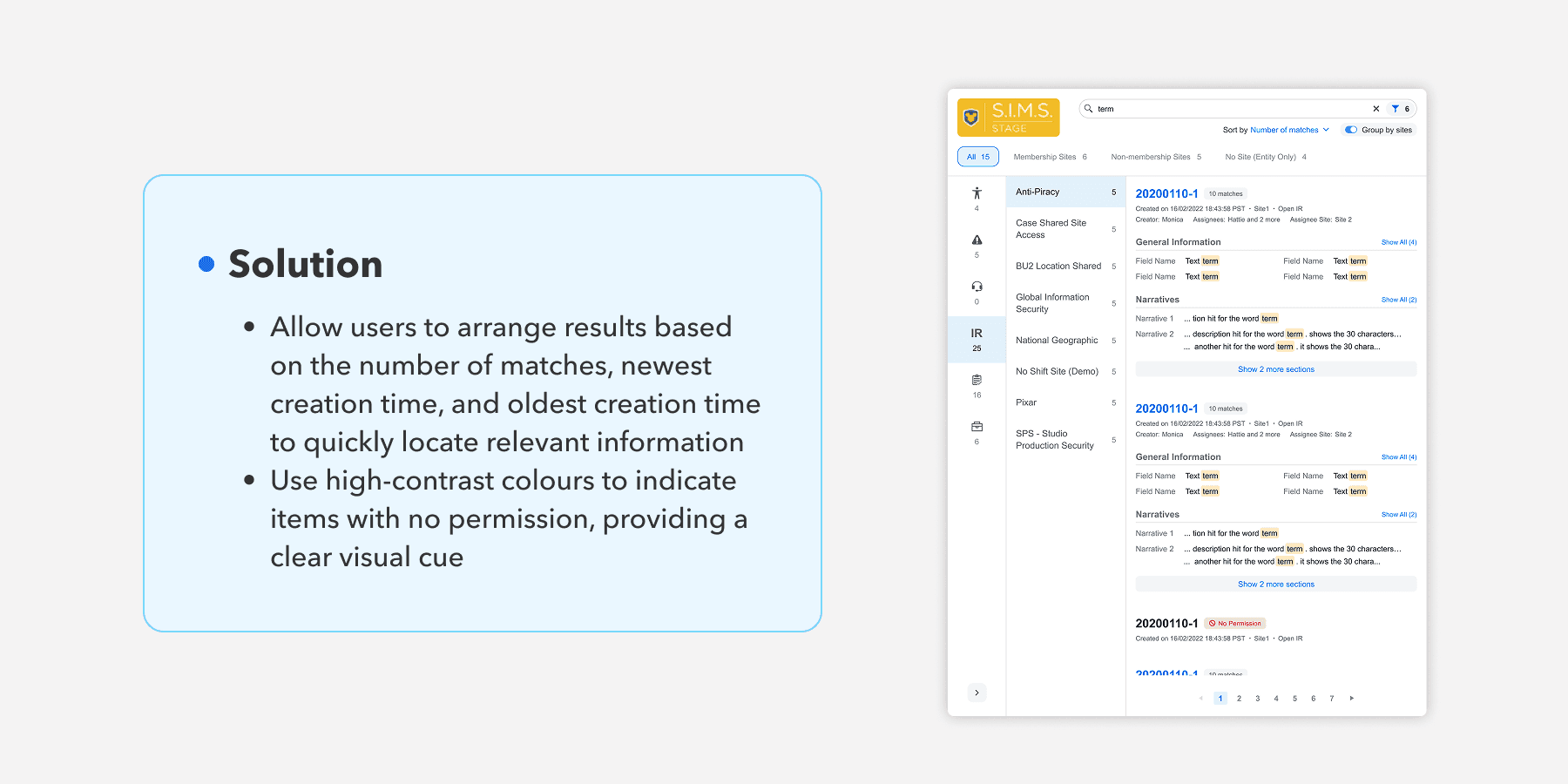
I introduced Group by Site, allowing users to organize results by physical location rather than navigating one continuous list.
Why
Grouping information around sites better matched the way analysts understood their environment, making large result sets easier to navigate while preserving important location context.

Validating the direction
I tested the redesigned experience to understand whether the new hierarchy, filtering, and site-based organization actually helped users navigate search results more efficiently.
The results showed improvements in both efficiency and overall experience:
20% reduction in search time
Users located relevant information faster with clearer filtering and result organization.
67% increase in user satisfaction
Participants responded more positively to the redesigned search experience.
The findings validated the direction while also identifying smaller interaction details for further refinement.
A more navigable search experience — without rebuilding the product
The redesign improved how users navigated large amounts of security information while staying within the project's technical and timeline constraints.
By focusing on information hierarchy, filtering, and location-based organization, I was able to improve the experience without introducing unnecessary complexity or requiring a complete rebuild of Global Search.
The project reinforced an important lesson for me: good enterprise design isn't always about adding more functionality. Sometimes the biggest impact comes from helping users make better sense of what already exists.