

Overview
Furniture decisions are difficult because people are not only choosing a product — they are choosing how that product will change a space.
A floor plan can show dimensions, while a 3D model can show the design, but neither always helps a client understand what the final space will actually feel like.
Mixed Reality (MR) bridges the gap between imagination and reality
Role
Product Designer
Platform
Meta Quest 3 · iPad
Focus
Spatial UX · Interaction Design · User Research
The Challenge
Traditional furniture shopping and interior design tools rely heavily on 2D images, measurements, floor plans, and 3D renders.
This creates a gap between seeing a design and understanding a space.
• Will the furniture fit the space?
• Will the layout work?
• Will the final space look right?
How might we help people experience the space instead of asking them to imagine it ?
Understand the interior designer’s workflow
I interviewed in-house interior designers and mapped their workflow from the initial client conversation to the final furniture recommendation.
I wanted to understand not only what designers do, but where communication breaks down between the designer and the client.
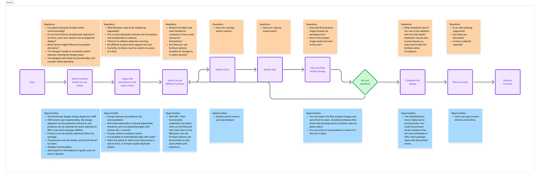
What I found the bigger challenge was helping clients understand the design from their own perspective.
The real problem wasn’t creating the design. It was communicating the design.
Prioritize
There were many possibilities for a mixed reality furniture experience, from changing materials and lighting to moving furniture and creating complete room layouts.
To keep the first experience focused, I prioritized features based on:
User value
Would this help users understand or communicate the design?
Frequency
Would users need this during a typical design conversation?
Feasibility
Could we deliver the interaction reliably within the technical constraints?
The goal was not to recreate every interior design tool in MR. It was to make the most important spatial decisions easier to understand.
Design for Spatial Computing
Designing for MR required a different way of thinking about interaction.
On a screen, the interface controls the user’s attention. In MR, the user is moving through a physical environment while interacting with digital objects.
How large should virtual furniture appear?
How should users understand depth and scale?
How do we keep the interface from blocking the real environment?
How should users discover unfamiliar controls?
As a user:
I experienced how spatial interfaces behave in the real world, focusing on:
• Virtual object placement
• Depth and scale
• Opacity and shadows
• How digital objects anchor to physical surfaces
As a observer:
I watched first-time users interact with Vision Pro to understand onboarding challenges.
• Confusion
• Hesitation
• Discovery
Three principles guided the design
Scale
Virtual objects need to feel connected to the real environment.
Awareness
The interface should not make users lose awareness of their surroundings.
Simplicity
Interactions should be easy to learn, especially for first-time MR users.
Define
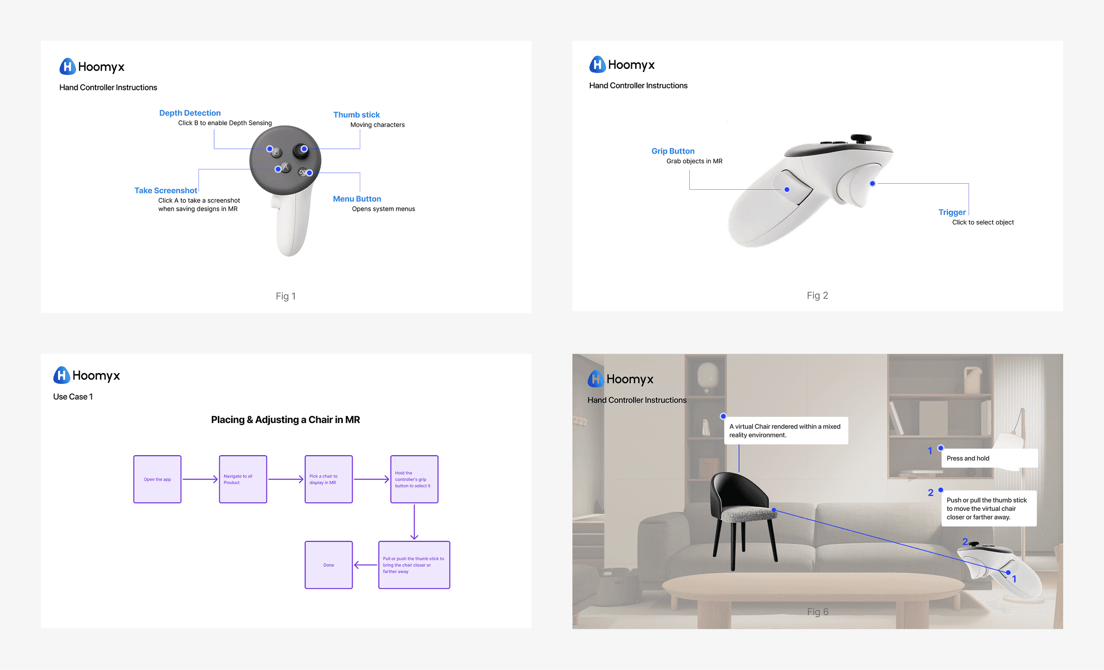
Unlike a mouse or touchscreen, VR interactions rely on controller inputs, each with a different level of precision and intent. Defining clear button mappings and documenting their behavior was essential to creating a consistent user experience.
User testing revealed that first-time users needed clearer guidance when interacting with VR controls. Based on this insight, I improved onboarding and added contextual support throughout the experience.
Below are a few examples from the guide.
Design
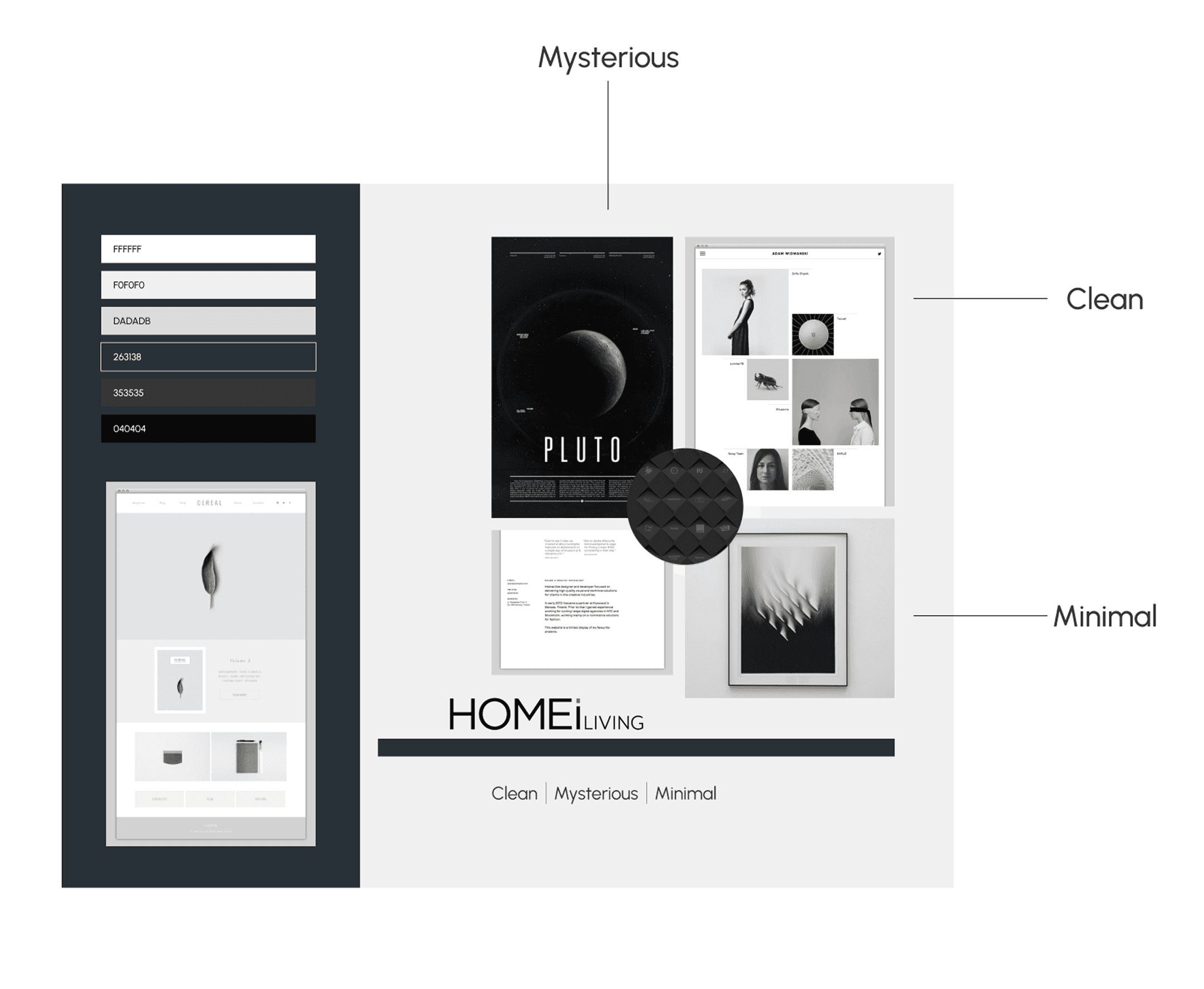
WHY
Black and navy communicate focus, confidence, and authority—qualities that resonate with high-end interior designers and reflect the premium nature of the experience.
White and grey provide a calm, neutral foundation that reduces visual noise and allows the 3D furniture assets to remain the primary focus.
Design Decisions
One of the biggest differences between MR and traditional VR is that the physical environment remains part of the experience.
I chose passthrough as the foundation of the interface so users could see their real surroundings while interacting with virtual furniture.
Design principle
The physical environment should be treated as part of the interface, not just the background.

Due to technical constraints from the development team, I made several design adjustments to ensure the experience remained reliable and scalable.
01 Reduce visual clutter
Changed the background to a solid colour to improve focus and reduce motion distraction.

02 Make navigation easier
Users needed to understand what they could do without having to experiment with every control.
I replaced hidden hover-based actions with visible labels and clearer navigation.
This made the available actions easier to discover and reduced the amount of trial and error required to learn the interface.
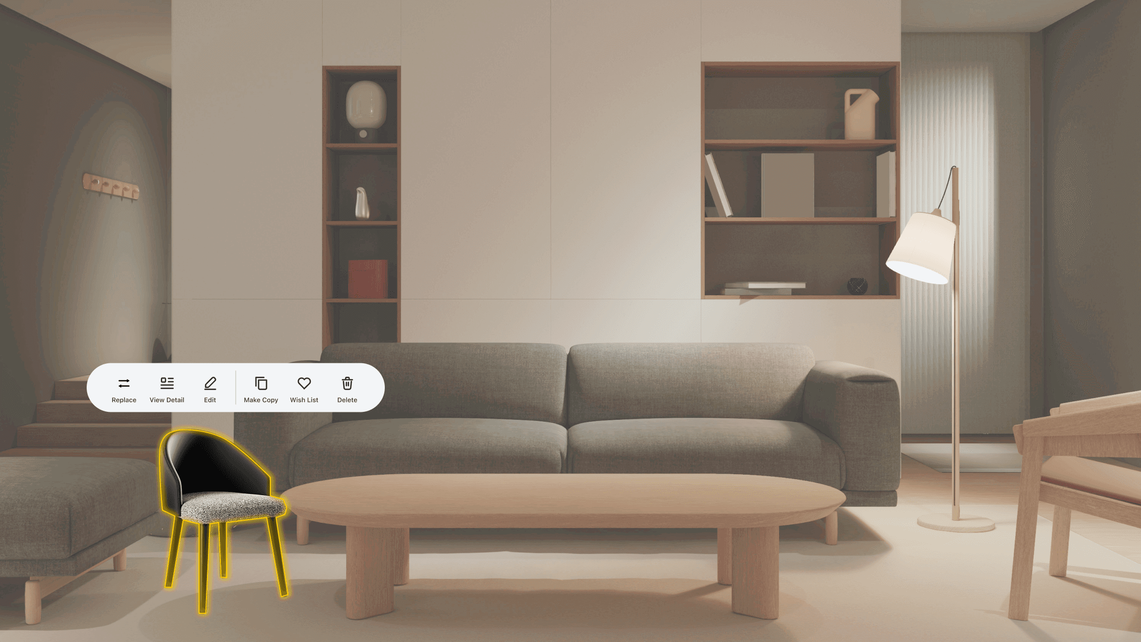
03 Contextual guidance
Added automatic tooltips to help users understand unfamiliar controls when they needed help.

Companion iPad Experience
The MR experience was designed alongside an iPad interface for interior designers.
This separation allowed each device to focus on what it does best instead of forcing every task into the MR environment.

Test
We conducted user testing to validate the usability of the MR experience and identify areas for improvement. The sessions revealed two key insights:
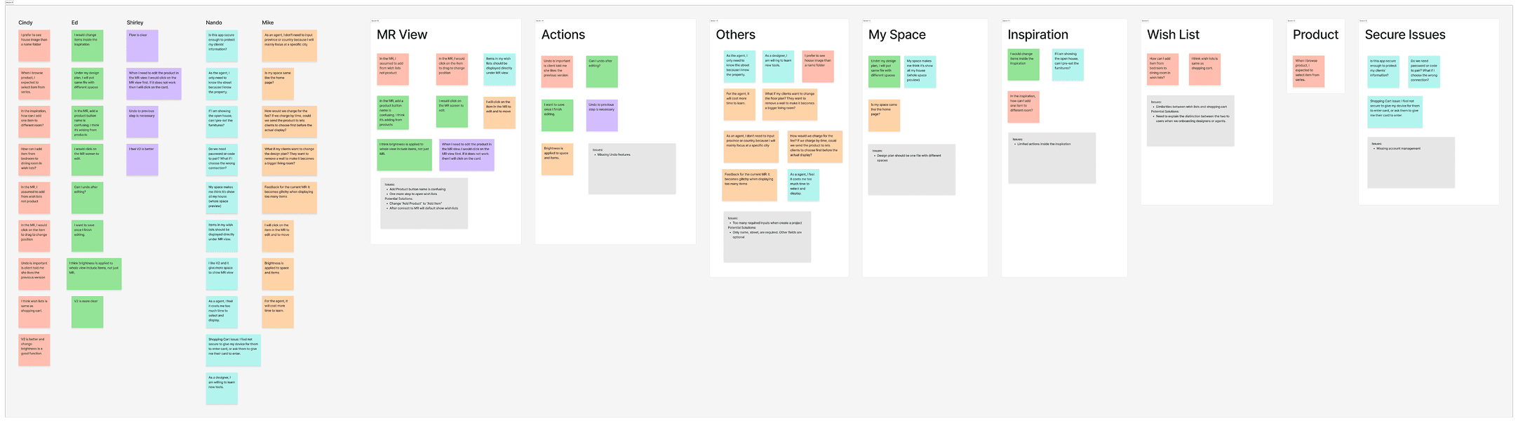
Improved onboarding
Improved onboarding and contextual instructions helped users understand controls faster.
Increased confidence
Users found that viewing furniture in their own environment helped them better understand scale and layout, reducing uncertainty.
Reflection
This project changed how I think about designing interfaces.
In a traditional interface, the screen is the environment. In MR, the environment becomes part of the interface.
That meant I had to think beyond screens and consider movement, scale, physical space, attention, and discoverability.
Good spatial design is not about adding more technology. It is about making the technology feel natural enough that people can focus on what they are trying to accomplish.